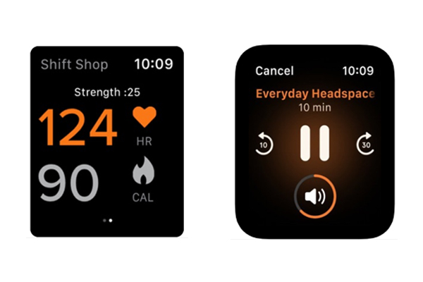
Apple Watch Apps present great levels of engagement by weaving app experiences on a truly mobile and on-the-go platform. But all the good stuff also brings some new challenges when it comes to the design effort and strategy that goes into Apple Watch app development. UI/UX designers and developers have to carefully design each screen and think of every interaction.
So, developing Apple Watch apps is an exciting experience but full of challenges. Today, I’m going to share some of the key things you should keep in mind while designing an Apple Watch app. It is also important to know that Apple Watch apps have some very different constraints and guidelines as compared to a regular iOS application either on mobile or on an iPad.
#1 – Quick & Easy
The core of an Apple Watch app is to provide the most desirable information to a user in the easiest, quickest, and most intuitive way. Hence, any Apple Watch app being designed has to have this characteristic built-in in order to be successful. Here the idea is, display the desired information clearly (without any noise or unnecessary data) using the best possible way (rings, graphs, menus, table, images, etc.) in the quickest time possible. Sluggish apps that take a lot of time to load fail to satisfy users, as users demand info on their smartwatches much faster than on their smartphones.

#2 – Navigation Structure
Like any other type of application, navigation is also the key and the backbone of a good watchOS app experience. It is also very crucial in watchOS apps to have intuitive and effective navigation as you don’t get a lot of real estate to define navigation buttons or breadcrumbs. Apple allows you to define navigation either with multiple levels (Hierarchical) or single-level app (Page Based). It is important to understand that none of these navigation types are right or wrong, rather they are options that you would choose based on your application workflow requirements. Choose the flow that helps you create the best experience of your app/service on the Apple Watch.
#3 – Color Selection
Another very important fact is that ultimately Apple Watch is a “watch” and not a phone or tablet that consumers will carry in their hands or pockets. They don’t expect (and want) to spend a lot of time looking at their watch just to understand what is being displayed. Another related challenge with all these watches (and watch apps) is that a lot of time they are used outdoors either under bright daylight or in the dark.
This is the reason Apple strongly recommends all its developers to design and build Apple Watch apps using high contrast colors. These are several colors that Apple specifically recommends while designing a watchOS app. Deep dive into the practices set by Apple when selecting colors for your app in their Human Interface Guidelines.
#4 – Use Complications Intelligently
Apple has introduced “Complications” with WatchOS that allows app developers to display specific information on the Watch face. There are several different types of complications available for developers to build in each of their applications. Every complication type (or family) has a unique display and UI elements to use. It is really up to the Apple Watch user if they want to include any of your app’s complication on their Watch face or not.
If you plan to include this feature into your watch app, make sure you are supporting as many complication families as you can in order to increase and maximize the coverage of all possible watch face combinations (based on your users’ liking). Apple’s Human Interface Guidelines go deep into designing and implementing complications.
#5 – Notifications
The Apple Watch app utilizes unobtrusive messages to communicate high-value immediate information through quick interactions. Make sure you customize your short-look and long-look notifications for your app if your notifications include photos, animated images, additional content, or custom color palettes.
#6 – Keep It Simple
A basic but very important aspect to understand while designing an Apple Watch app is to keep things simple without adding too many customizations or experiments. With this limited visual space and interaction time, as a developer, you would like to convey your message and share the information with your users rather than understand any new representation or visual.
BONUS Don’t Use Too Many Levels
As mentioned above, you don’t get the liberty to use elements like breadcrumbs in your watch application, it is very much recommended not to have too many (more than 4) level when you are designing your application with Hierarchical Navigation.
Conclusion
These are some of the approaches that you have to keep in mind when working on your Apple Watch app, the better you utilize these features the more natural and delightful the experience you create will be. Once you check all of these boxes when you’re done, your app will be able to take full advantage of the Apple Watch and watchOS. For an in-depth guide on designing user interfaces for your Apple Watch app take a look at Apple’s Human Interface Guidelines.
Working on your Apple Watch app? Let us help you create a truly mobile and on-the-go experience designed for smartwatches. Learn more about Wearable App Development.